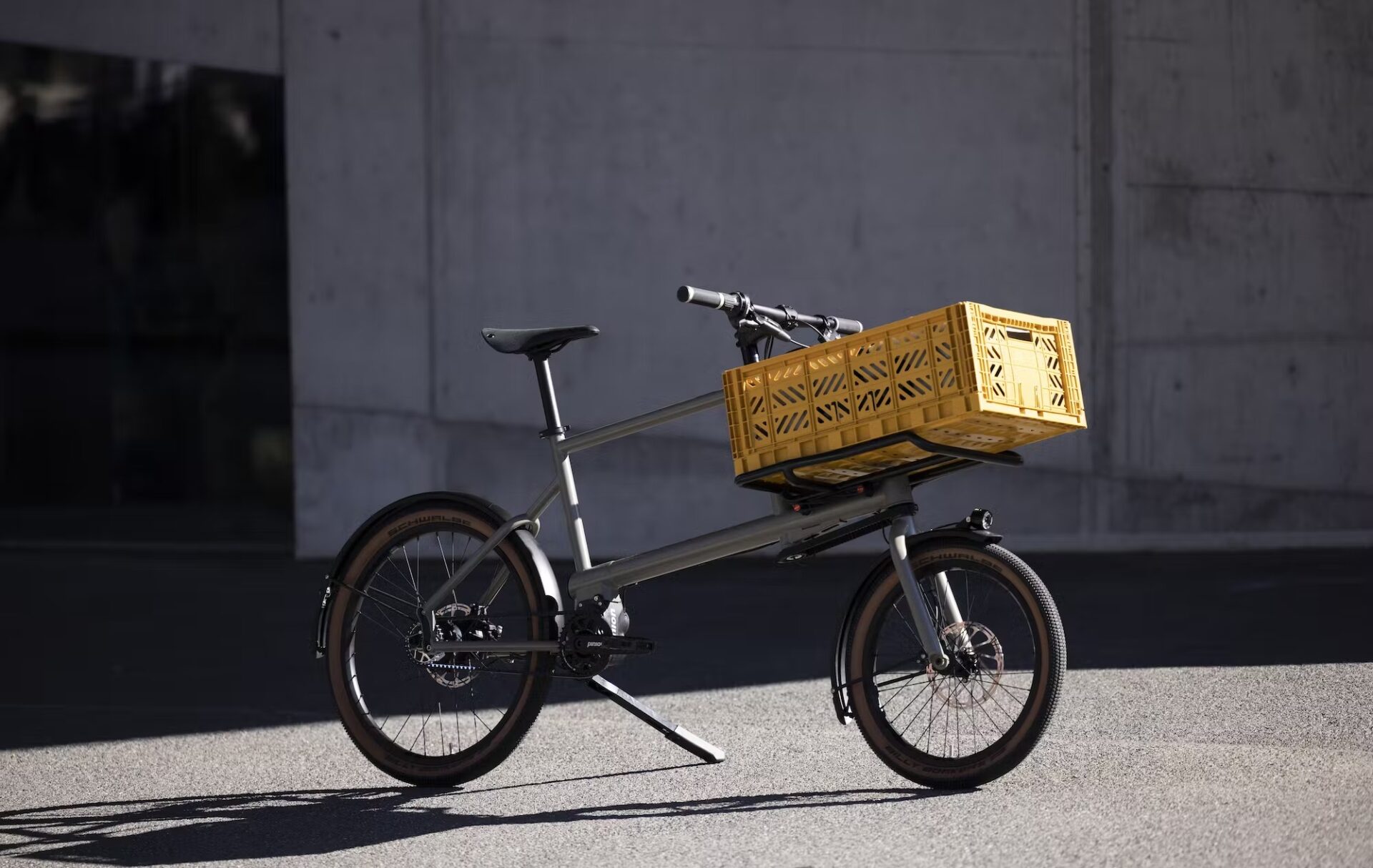
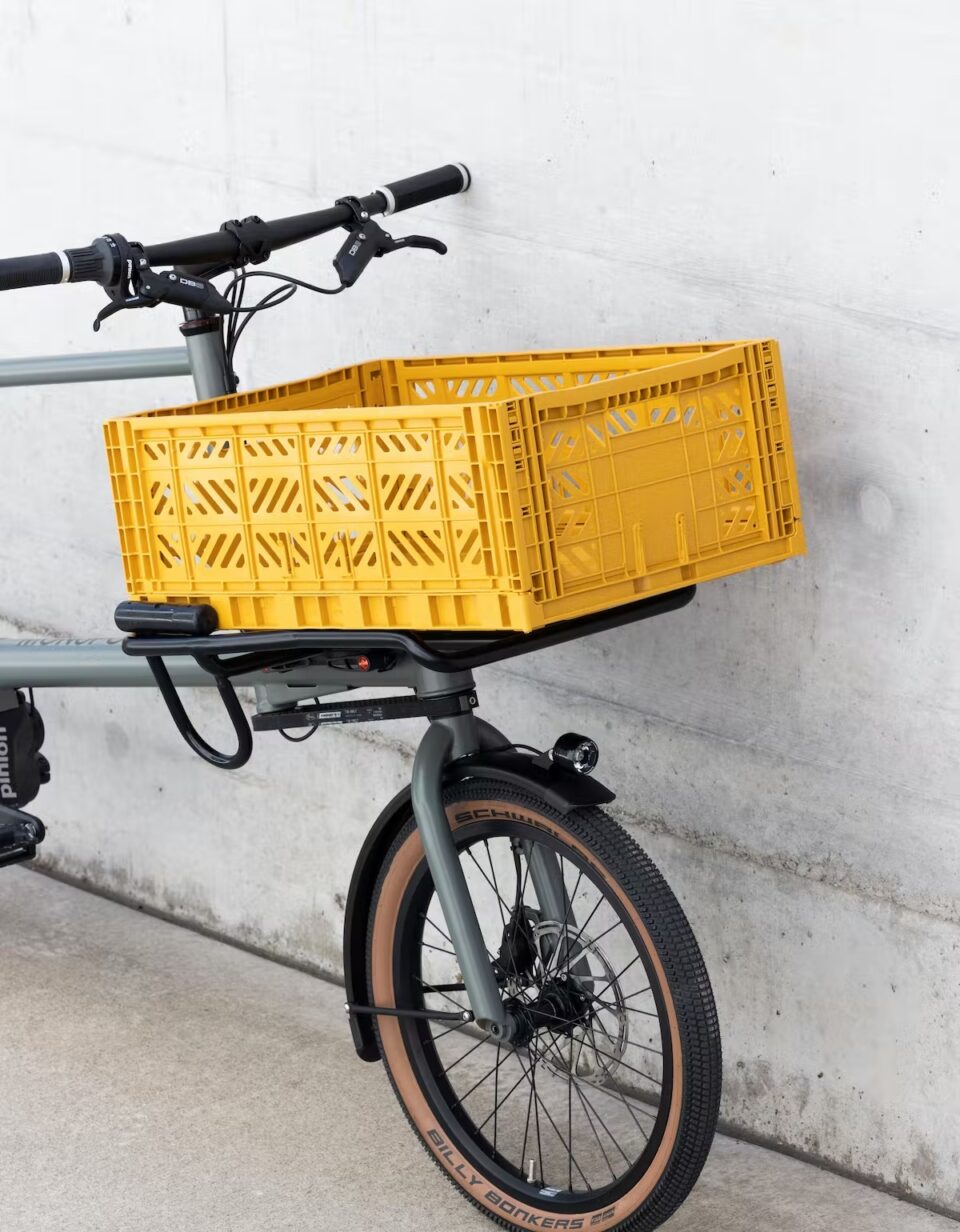
MONoPOLE is a Swiss cargo bike startup. In their own words: “Our toolbike No O1 is the perfect blend between a cargobike, an agile urban bike and an e-bike. It is the companion to meet all your urban mobility needs. For work, shopping, or your off-time adventures, you will be able to cargo all your stuff and ride with incredible ease, comfort and performance.”
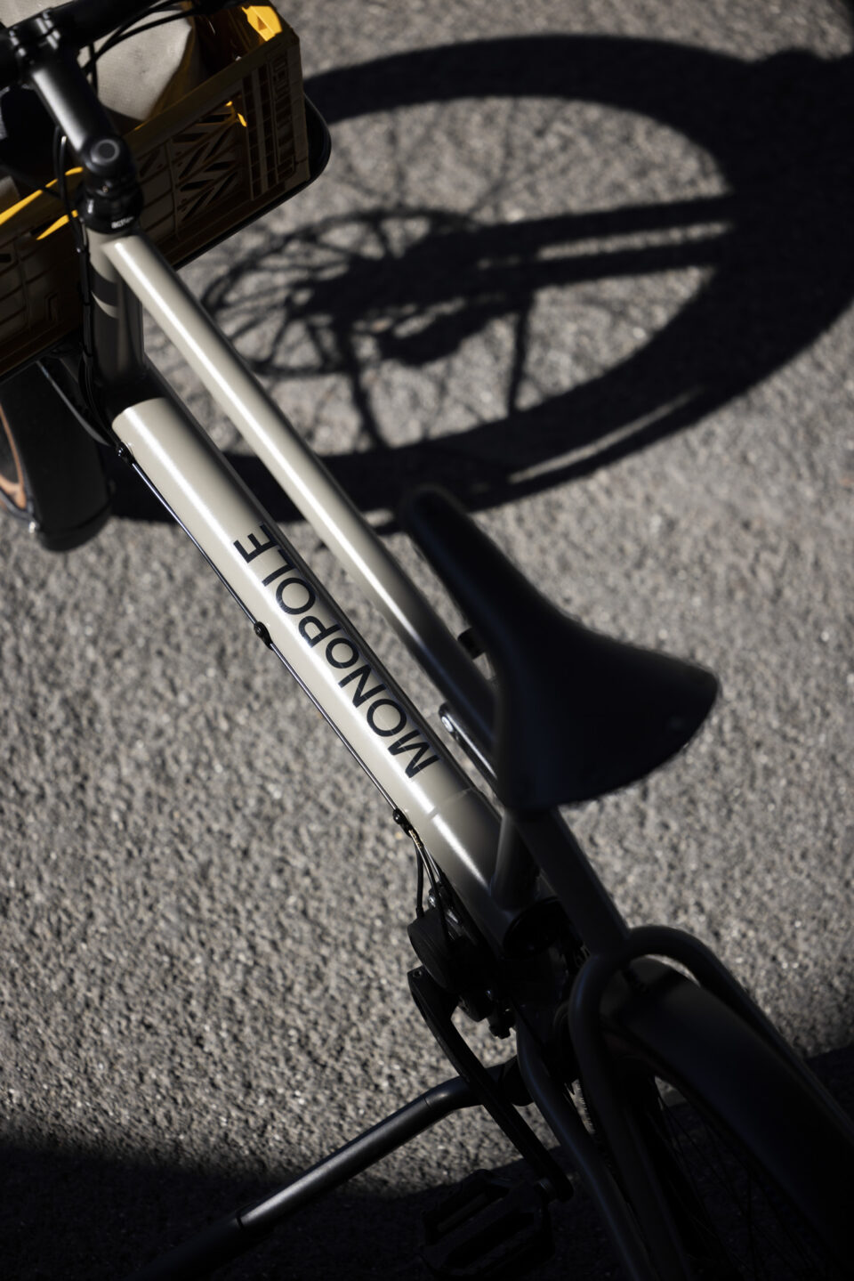
MONoPOLE comissioned us to create their visual identity. During our research we looked into the cargo bike as a product category. A common denominator for the category was the size of the wheels — they usually have two different sizes. At the same time the name MONOPOLE has an inherent symmetry with the three Os, which could resemble bike wheels.
Once we had identified the characteristic of the differently sized wheels, we experimented with implementing that observation in the wordmark. The use of the lowercase O in the center of the uppercase word, makes for a simple, yet recognisable logo. Furthermore, the main characteristic of the wordmark can be replicated with any typeface. So the brand will still be recognisable if mentioned in an email or an article.
Photos courtesy of MONoPOLE
Services: graphic design, concept development